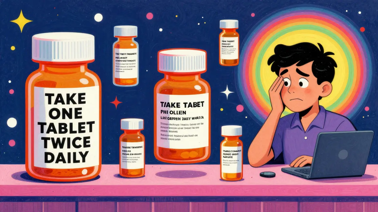
Have you ever opened a new prescription and thought, Wait, this label looks nothing like last time? You’re not imagining it. One month, your pill bottle has big, bold letters telling you exactly what the medicine is for. The next, it’s cramped, confusing, and full of tiny text you have to squint at. Even if you refill at the same pharmacy, the layout can change. Why? Because in the United States, there’s no single rule for how your prescription label should look - and that’s a serious problem.
There’s No National Standard for Prescription Labels
The FDA sets rules for how drug companies write professional labeling - the thick booklets doctors and pharmacists use. But the label stuck on your bottle? That’s a different story. The U.S. Pharmacopeial Convention (USP) released clear guidelines in 2012 called General Chapter <17>. These standards were built on years of research into how patients actually read and understand labels. They recommend things like:- Using sentence case: "Take one tablet twice daily" instead of "TAKE ONE TABLET TWICE DAILY"
- Using a clean, easy-to-read font like Arial, not Times New Roman
- Keeping text black on white for maximum contrast
- Adding why you’re taking the medicine: "for high blood pressure," not just "for HTN"
- Using 1.5 line spacing so lines don’t blur together
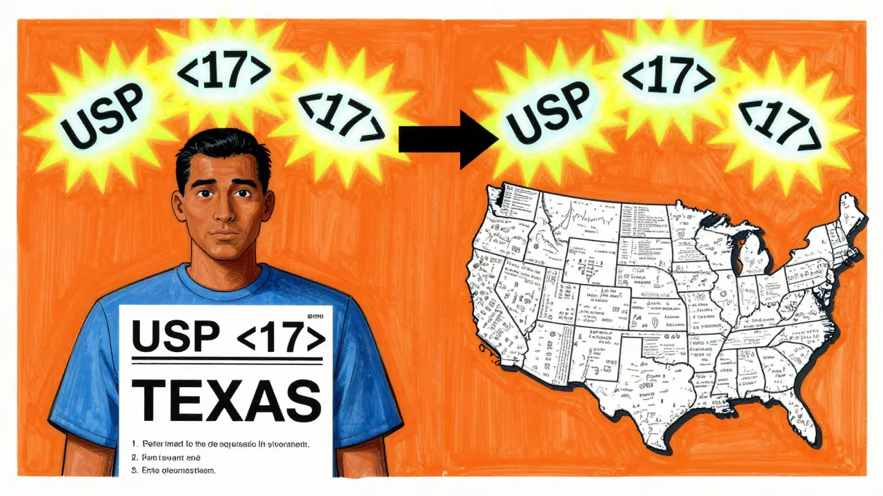
These aren’t suggestions for designers - they’re evidence-based rules proven to reduce mistakes. Yet, the FDA doesn’t enforce them. Instead, each state’s board of pharmacy decides whether to adopt them. As of 2023, only 28 states have fully adopted USP <17>. That means if you live in Texas, your label must include a specific prescription ID number in a font no smaller than 10-point. In California, some labels must be printed in both English and Spanish. In states with no rules, pharmacies use whatever system their software gives them.
Why Your Label Changes Between Refills
You might think, "I go to the same CVS or Walgreens every time. Why does it look different?" The answer is simple: pharmacy management systems. There are about a dozen major software platforms used across the country, and each one formats labels differently. Even within the same chain, a store in Ohio might use one system while a store in Florida uses another. When you refill, the system pulls your info and prints a label based on its own template - not a national standard.Pharmacy technicians have noticed this. A 2022 survey on the Pharmacy Tech Forum found that 73% of techs had customers come back confused because the label format changed between refills. One patient took a blood thinner at double the dose because the word "twice daily" was moved from the top of the label to the bottom. The patient didn’t see it the second time. That’s not a rare mistake - it’s common.
The Real Cost of Confusing Labels
It’s not just about annoyance. Misunderstanding your label can be deadly. Dr. Michael Cohen of the Institute for Safe Medication Practices says name confusion and unreadable labels are the top two reasons people make medication errors. Studies show that if every label followed USP <17> standards, medication errors could drop by 30% to 40%. That’s not a guess - it’s backed by data from hospitals and pharmacies that have switched.In Texas alone, between 2019 and 2022, 417 reported medication errors were linked to label confusion. Nationwide, the National Community Pharmacists Association found that 68% of patients have trouble understanding their labels at least sometimes. One in five (22%) say they’ve made a mistake because the label was unclear. These aren’t just numbers - they’re people who took too much, took the wrong pill, or skipped doses because they couldn’t read what was written.
Accessibility Is Still an Afterthought
What about people with vision problems? Or those who don’t read English well? USP <17> says pharmacies should offer large print, braille, or audio labels - and explain these options. But a 2022 audit by the American Pharmacists Association found that only 38% of pharmacies regularly offer large print. Just 12% offer braille. And 5% offer audio. That’s not good enough. If you’re blind or have low vision, your prescription label should be as easy to use as your phone. Right now, it’s not.The Access Board made it clear: pharmacists must explain these options in private. They must make sure the audio or braille version has the same information as the printed label - in the same order. But few pharmacies do. Most assume if the print label is there, that’s enough. It’s not.
Change Is Coming - Slowly
The good news? Things are starting to shift. In April 2023, CVS Health announced it would roll out USP <17> labels across all 10,000+ of its pharmacies by the end of 2024. Why? Because a pilot in 500 stores cut patient questions about labels by 33%. That’s money saved, time saved, and mistakes prevented.The Biden administration’s 2022 Patient Safety Action Plan set a goal: 90% of states will adopt standardized labeling by 2026. The FDA also issued draft guidance in June 2023, hinting that federal rules might be coming. But industry experts say it’ll still take years - if not a decade - before every label looks the same.
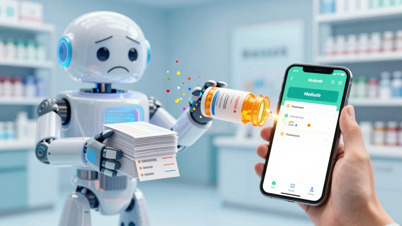
Meanwhile, the medication adherence tech market is growing fast. Apps like Medisafe and MyTherapy now scan your physical label and turn it into a clean, consistent digital version on your phone. They translate "Q12H" into "Take every 12 hours," and add reminders. For now, that’s how many people are solving the problem - not by changing the label, but by bypassing it.
What You Can Do Today
You don’t have to wait for a law to change. Here’s what you can do right now:- Ask your pharmacist: "Can you print this label in large print?" or "Do you have an audio version?"
- Take a photo of your label every time you get a refill. Compare them. If something changes - like the timing or the reason - ask why.
- Write down your instructions in your own words. If the label says "Take one tablet by mouth twice daily," write: "I take one pill in the morning and one at night. This is for my blood pressure."
- Use a pill organizer with clear labels. Even if the bottle label is messy, your organizer can be simple.
- Ask for a printed copy of the medication guide that comes with your prescription. It’s usually clearer than the bottle label.
Medication safety shouldn’t depend on which state you live in or which pharmacy system your pharmacist uses. It should be simple, clear, and the same for everyone. The tools to fix this exist. What’s missing is the will to make it universal.


Nerina Devi
February 23, 2026 AT 02:07Dinesh Dawn
February 24, 2026 AT 21:02Vanessa Drummond
February 26, 2026 AT 20:24kirti juneja
February 28, 2026 AT 08:58Haley Gumm
March 1, 2026 AT 22:05Gabrielle Conroy
March 2, 2026 AT 20:12Spenser Bickett
March 3, 2026 AT 07:28Christopher Wiedenhaupt
March 4, 2026 AT 00:57John Smith
March 4, 2026 AT 14:37Natanya Green
March 6, 2026 AT 03:22